
A thumbnail is often the deciding factor in whether someone chooses to engage with your content. Before viewers read a title or watch a video, they usually notice the thumbnail first. An eye-catching design can increase clicks, improve visibility, and help your content stand out in a crowded online space.
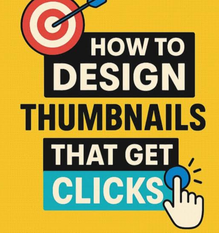
The Importance of a Strong Thumbnail
Think of a thumbnail as a first impression. It gives viewers a quick preview of what to expect and influences their decision to click. Even excellent content can be overlooked if the thumbnail fails to capture attention.
An effective thumbnail should be visually appealing, easy to understand, and relevant to the content.
Focus on Simplicity
The most successful thumbnails are often the simplest. Too many elements can make a design confusing and difficult to process.
To keep your thumbnail effective:
Use a clear main image
Avoid unnecessary details
Create a strong focal point
Ensure the design remains visible on smaller screens
Viewers should immediately understand the topic without having to look closely.
Use Emotion to Capture Attention
People naturally respond to emotion. Images that convey excitement, surprise, curiosity, or anticipation can encourage viewers to stop scrolling and take notice.
When using faces, choose expressions that genuinely reflect the message or story behind the content.
Add Minimal but Impactful Text
Text can strengthen a thumbnail when used correctly. Instead of overcrowding the design with words, focus on a short phrase that highlights the most interesting aspect of the content.
Good thumbnail text is:
Brief and easy to read
Large enough for mobile users
Relevant to the content
Designed to spark curiosity
Make Colors Work for You
Strategic use of color can help your thumbnail stand out from competing content.
Consider using:
Contrasting colors for readability
Bright accents to draw attention
Consistent brand colors
Clean and balanced color schemes
Strong visual contrast makes important elements easier to notice.
Create Curiosity
A successful thumbnail often encourages viewers to learn more. It provides enough information to generate interest while leaving some questions unanswered.
You can create curiosity by:
Teasing a surprising result
Highlighting an unusual situation
Showing a dramatic moment
Hinting at a valuable takeaway
The key is to intrigue viewers without misleading them.
Build a Recognizable Style
Consistency helps establish a strong brand identity. Using similar fonts, colors, layouts, and visual elements across your content makes it easier for audiences to recognize your work.
Over time, this familiarity can improve trust and encourage repeat viewers.
Continuously Experiment
Thumbnail performance varies depending on the audience, platform, and content type. Testing different designs can reveal what works best.
Try adjusting:
Fonts
Colors
Image placement
Text length
Visual emphasis
Analyzing results and making improvements can lead to higher click-through rates over time.
Mistakes to Avoid
Common thumbnail mistakes include:
Using too much text
Creating cluttered designs
Choosing low-resolution images
Using weak color contrast
Making misleading promises
A clear and honest thumbnail generally performs better in the long run.
Final Thoughts
An effective thumbnail can significantly increase the likelihood of someone clicking on your content. By focusing on clarity, emotion, simplicity, and strategic design choices, creators can attract more viewers and improve overall engagement.
While there is no perfect formula, thoughtful thumbnail design can help turn casual browsers into interested viewers and give your content a stronger chance of success.