
-
Jonathannwokpor89
- September 21, 2025
- 0 Comments
- blog
Colors are more than just visual elements—they are powerful tools that shape perception, evoke emotions, and influence decision-making. In the world of branding, color psychology plays a crucial role in how consumers connect with a company and its products.
When businesses choose the right colors, they can increase brand recognition, create emotional appeal, and even drive customer loyalty. But when colors are mismatched or misused, they can confuse audiences or send the wrong message.
In this article, we’ll explore the psychology behind color in branding, the emotions colors evoke, and why choosing the right color palette is essential for your brand identity.
What is Color Psychology in Branding?
Color psychology is the study of how colors affect human behavior, emotions, and perceptions. In branding, it involves strategically using color to communicate a company’s message, values, and personality.
For example:
- Fast-food brands often use red and yellow because they stimulate appetite and create a sense of urgency.
- Luxury brands lean on black, gold, or silver, which convey sophistication and exclusivity.
- Eco-friendly companies commonly use green, symbolizing nature and sustainability.
By understanding color psychology, businesses can craft a visual identity that resonates deeply with their target audience.
The Emotional Impact of Colors in Branding
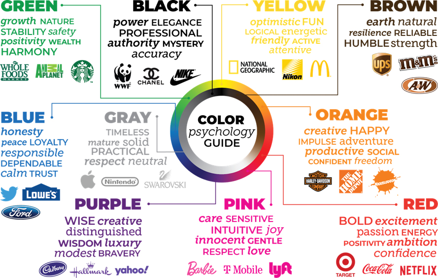
Different colors trigger different psychological responses. Here’s a breakdown of some common colors and their branding impact:
1. Red
- Emotions: Excitement, passion, energy, urgency
- Used by: Coca-Cola, Netflix, YouTube
- Effect: Creates a sense of boldness and grabs attention instantly.
2. Blue
- Emotions: Trust, security, calmness, professionalism
- Used by: Facebook, PayPal, LinkedIn
- Effect: Builds consumer trust and is often chosen by financial and tech companies.
3. Yellow
- Emotions: Optimism, warmth, happiness, friendliness
- Used by: McDonald’s, IKEA, Snapchat
- Effect: Inspires positivity and catches the eye, but should be balanced to avoid strain.
4. Green
- Emotions: Growth, health, sustainability, balance
- Used by: Starbucks, Whole Foods, Spotify
- Effect: Strongly linked with eco-conscious brands and wellness industries.
5. Black
- Emotions: Luxury, sophistication, power, authority
- Used by: Chanel, Nike, Apple
- Effect: Elevates a brand’s prestige and communicates exclusivity.
6. Purple
- Emotions: Creativity, royalty, imagination, wisdom
- Used by: Cadbury, Hallmark, Yahoo
- Effect: Appeals to brands targeting innovation, luxury, or spirituality.
7. Orange
- Emotions: Enthusiasm, affordability, adventure, friendliness
- Used by: Fanta, Nickelodeon, Harley-Davidson
- Effect: Conveys energy and accessibility, popular with brands targeting younger audiences.
8. White
- Emotions: Purity, simplicity, clarity, cleanliness
- Used by: Apple, Adidas, Tesla
- Effect: Minimalist and timeless, often paired with other bold colors.
Why Color Psychology Matters in Branding
- First Impressions Count – Research shows that people form judgments about products within 90 seconds, and up to 90% of that judgment is based on color.
- Boosts Brand Recognition – Consistent use of colors increases brand recognition by up to 80%.
- Influences Buying Decisions – Colors can trigger emotional responses that influence whether consumers feel compelled to make a purchase.
- Differentiates from Competitors – Unique color palettes help brands stand out in a crowded marketplace.
- Strengthens Brand Identity – Colors align visual elements with a brand’s values, story, and customer promise.
Choosing the Right Colors for Your Brand
When selecting brand colors, consider:
- Target audience – What colors appeal to their emotions, culture, and lifestyle?
- Industry norms – Do you want to align with or disrupt traditional color choices?
- Brand personality – Is your brand playful, professional, bold, or luxurious?
- Cultural meanings – Colors carry different symbolism across cultures (e.g., white represents purity in Western culture but mourning in some Asian cultures).
A thoughtful combination of primary, secondary, and accent colors ensures a flexible but consistent visual identity across all platforms.
Conclusion
The psychology behind color in branding is not just about aesthetics—it’s about strategic communication. Colors influence how customers feel about a brand, how they engage with it, and whether they stay loyal over time.
By understanding the psychological impact of colors and applying them wisely, businesses can build stronger emotional connections, increase recognition, and stand out in competitive markets.
So next time you design a logo, website, or marketing campaign, remember: color isn’t just decoration—it’s a silent brand ambassador.
Disclaimer
This article is for informational and educational purposes only. While color psychology provides useful insights, branding success depends on multiple factors including market research, strategy, and execution. Always consult a professional branding or marketing expert before making major brand identity decisions.